Wednesday, November 11, 2015

Peoria Playhouse Children's Museum

   Last week I posted a set of icons I was working on for Peoria's children's museum. I just wanted to make this post to share the final set with everyone and talk a bit about the wayfinding app that I am working on using these icons. The brief for this project involved created a wayfinding app for the children's museum that was functional for both children and adults. I chose to go with a more complex, vectorized look, for the exhibit icons as opposed to the standard one or two color icon. I wanted the icons to be clear, but also colorful and playful. I think I was fairly successful in crafting a unified set, but I might need to make a second icon set with reduced detail  so that they can function better at smaller sizes. These icons would look great on wayfinding signs and physical maps, but maybe not so much on an iPhone5 screen. 


   With the actual app itself, I decided to focus on a paper airplane as a recurring motif.  The Peoria Playhouse logo features an airplane flying from the house and their website features the image of the airplane heavily. I was attracted to the plane's resemblance to an arrow and the way that the trail lines could be used to guide the user. The splash page could feature the airplane flying around before finally coming to rest beside the Peoria Playhouse text. The header typeface I chose (Bebas) is big and bold and in all caps. I went with this font because I thought it would be appealing to both kids and adults without appearing too childlike. 

Another aspect of the brief involved creating engagement for users when they leave the museum. This is the part of the assignment that I am still working on. Right now, I've only designed a page that details the museums current exhibits. I extended the  vectorized look/incorporated the airplane in the exhibit info pages. I also designed the apps navigation (search, explore, and home) in the same vector style as the rest of the icons. 

When it came to the actual on site way finding, I wanted the maps to contrast the complexity of the icons. I went with a very simple, one color, line based look on the maps. This allowed the maps to fit in better with the type and highlight in the same manner. I also wanted to incorporate a swipe down menu of the exhibits into the map, but I'm not sure if I illustrated that well.

Finally, I am working on a geolocation feature where the airplane can guide the user in real time to exhibits. Again I am making heavy use of the vectorized look and simple typography. This app is still a work in progress, but I like how it is turning out so far.


Wednesday, November 4, 2015

Icon Sets


My WIP icon set for the museum 
    Our current infographic project involves creating an entire wayfinding system for Peoria's children's museum. One of the key elements of any good wayfinding system is the icon set. While some icons, like restroom and coatrooms are universal, others are open to interpretation. I just wanted to take a moment to discuss what goes into to creating a cohesive and clear set of visual icons.
    First of all, icons need to be universal. Don't try to get metaphorical or complex, with pictograms the first thing that comes to mind is often the best choice. Sites like iconfinder.com and thenounproject.com can also be great for determining what the universal symbols for ideas are. A pictogram should be able to clearly communicate an idea visually , without the need for language. Some of the best examples of of icon sets come from wayfinding systems for the olympic games. The designers of these sets are forced to create images that cross both language and cultural barriers. My favorite example of these has always been Lance Wyman's work for the 1968 Mexico City Olympics. They were colorful and simple, but also integrated a lot of pattern that helped to unify the work.
That's really the second most important aspect of crafting a set of pictograms, they need to feel like a unified set. It is essential to maintain a unified line weight and level of complexity across the board. Notice how Wyman's graphics all maintain the aesthetic of white on a bright color with very simple shapes. Another thing that unifies the pictograms is there consistent visual weight. Although the images might have varying amounts of negative and positive space, they are all sized to pack the same visual punch. It is always a good idea to design all of your icons on a grid in order to make sure that they are proportional to each other. Ultimately however, it is up to the artist's eye to determine whether something should be scaled to equalize visual weight. 
   The final factor to consider is scalability. Icons should be able to function at a variety of sizes, from a phone screen to signage. It is a good idea to work small and then scale up later. Another popular option is to create two sets; a simpler one for extremely small sizes and a more complex set for larger sizes. Just because something looks fantastic on your screen doesn't mean it will be legible on someone's old iPhone 4. 
   Although my designs above are a work in progress, I attempted to maintain a consistent level of complexity and visual weight across them. I'm liking how they are turning out so far, but they could certainly use more work. 


Wednesday, October 28, 2015

Gym Survival Guide

  
 My latest infographics assignment might have been the vaguest brief I have ever been delivered. Part of that might have been that this class project wasn't for an actual client. Our professor's  fictional client asked only for a series of infographics promoting increased gym membership; the format was up to us and the only thing that had to be included was an attached bar graph. Since I didn't have to sell anyone on my ideas, I decided to get as weird with it as possible. I wanted to have some fun and do some drawings as well. Early on in the creative process I latched onto the idea of "survival of the fittest" and ran with it as far as I could. I was drawing on Darwinian ideaology/imagery as well as the design of old army field manuals and survival guides. I was inspired by books, like the Zombie Survival Guide below, that have been cropping up more and more lately; the kind of thing you see while in line at checkout at Barnes and Noble. 


So I went for this strange mish-mash of infographics related to the gym and imagery related to Darwin. It was so out there that I knew it would never appeal to a mass audience, but it was humorous and fun to work on. This was a project for me and whatever niche audience it appealed to.
I wanted the book to look old and weathered so I cast everything on scans of weathered paper. I also scanned in some images of ink I had brayered onto white paper to give things a distressed look. In my aping of these novelty books,  I opted to use a minimal color scheme. While in many cases such a limited palette can be detrimental to an infographics legibility, I think I managed to pull it off this time around. It was a fun challenge to incorporate both the distressed look and the one color into successful infographics. I also drew upon the Darwinian imagery to add humor and a unique twist into my layouts. The image of a nerd building muscle was combined with Darwin's textbook depiction of the evolution of man to give a new spin on working out. The headlines referred back to evolution and extinction in order to connect to this central idea of survival. Some viewers might think that the whole thing was a stretch, attempting to draw a line between the gym and Darwin, but to me that was part of the joke. 


This was also the first time I had really messed with Illustrator's graphing tools. They were a lot more cumbersome and unintuitive than I could have imagined. I managed to figure out pie and bar graphs, but no matter what I did, I could not figure out the line graphs. I ended up just creating my line graph from scratch. All in all, I think that the programs graphing tools are more trouble than they are worth. I found myself bringing the graphs I made into photoshop to clean them up and make further changes.  


My favorite page of the guide was a simple what not to wear graphic. This was one of the first pages I worked on and where it all came together for me. I opted to go with Bodoni for the body text because I wanted a serif font that would have existed during Darwin's lifetime. Besides, the font is a classic and it contrasts well with the sans-serif letterpress style font I assigned to the headlines. Still maybe I only preferred this page because I got to draw the monkey. 


Overall, I love the look and feel of the finished product. The only issue is that this kind of thing would never fly in the business world. It functions better as an amusing bit of humorous design than as an actual piece. 


Wednesday, October 21, 2015

Native Americans in American Painting

There's such a small number of students in my American art history course that our instructor ended up ditching her initial syllabus, opting instead to cover whatever appealed to her in the moment. As a consequence of this new approach we ended up engaging in a nearly three week  long discussion of the portrayal of Native Americans in American art. It might be easy to dismiss these images of Indians as racist stereotypes, but every stereotype serves a function. An argument can certainly be made that the depictions of Native Americans in 18th and 19th century art not only aided in the dehumanization of Indians, but also made it easier for American settlers to push the indigenous people off of their land and into reservations.  
The term “manifest destiny” was coined in 1845, but it described an idea that had already been present in American culture for quite some time. The belief that the nation’s expansion from coast to coast was a necessary part of the progress of civilization fueled western settlement and consequently Native American removal. The image of the Native American in art changed to reflect and in some ways justify this ideology of "manifest destiny". Over the course of the 18th and 19th centuries the image of Native American transformed from one of nobility to one of vicious savagery and the inevitably of extinction.  Indigenous people were distilled to stereotypes; tribe distinctions were ignored, Native Americans became a symbol for the past and the cliché of the Indian as “one with nature” was born.My art history instructor argues that image of Native American  can therefore be generally classified into one of three categories: the noble savage, the barbarian, and the doomed Indian. 
France Bringing the Faith to the Indians of New France
France Bringing the Faith to the Indians of New France by Claude Francois is an early example of the noble Indian archetype in painting. The 1675 French work commemorates France’s arrival to the Canadian provinces. It depicts a native receiving a piece of Catholic art, symbolizing Christian faith, from a personification of France. In the background the wild landscape shifts as the Indian’s huts sprout crosses at the top. Despite the lighter skin tone, it is immediately apparent that the figure on the left is indigenous judging from his beads, braids and coral necklace earrings. These markings combined with the landscape mark the figure as savage. However, France Bringing the Faith to the Indians of New France is undeniably an image of the noble savage. The Native American appears kneeling, semi nude, but draped in fabric covered with the fleur de lis (the symbol of French royalty). The portrayal of Native American as noble savage continued into the late 18th century. Benjamin West’s Death of General Wolfe includes a crouching Indian figure among the crowd of onlookers. His posture is contemplative reminiscent of Michelangelo in Raphael’s The School of Athens. Out of all of the figures in the painting, the Indian is portrayed as the wisest.
Death of General Wolfe
            As America moved into the 19th century the ideas of manifest destiny and romanticism began to impact images of Native Americans in art.  Romanticism was a genre of painting that stressed intense emotion and tended to focus on exotic and outsider culture. The style was often concerned with the “other”, or peoples outside of White American culture, therefore African American’s and Native American’s were often prominent in Romantic paintings.  The Death of Jane McCrea by John Vanderlyn is an example of Native American as barbarian. The 1804 image is based on a true story where American settlers were attacked by Indian mercenaries allied with the British. Vanderlyn’s work stresses impending death as two Indians prepare to kill and scalp Jane McCrae. The Natives are depicted as fierce and muscular as the American cowers under them. Her pure white skin stands in stark contrast to their red skin. 
The Death of Jane McCrea
Forty years later, and just one year after the term manifest destiny was coined, Vanderlyn painted The Landing of Columbus. The artwork is largely concerned with Columbus’ arrival in America while the indigenous people are confined to the background. The Native Americans are barbarian: dehumanized as they cower in the jungle, naked, becoming part of the landscape.
The Landing of Columbus.
 Thirty years later the lithograph Daniel Boone Protects his Family perfectly encapsulated the idea of manifest destiny. The print shows the pioneer fighting with a native. The Indian is depicted as a savage who is easily dominated. The images of Indian as barbarian paint the people as a threat that need to be driven from the West if American culture is to survive.
Daniel Boone Protects his Family


            As westward expansion continued, the Native American began to be portrayed as a remnant of the past and the archetype of the doomed Indian was born. 1826’s Falls of the Kaaterskill by Thomas Cole is an autumnal waterfall landscape.  A generic Native American sits atop the waterfall, alone, as nature crumbles around him. Cole’s painting is a nostalgic image. The lone Indian is fragile, a weak victim. 
Falls of the Kaaterskill
Similarly, The Dying Tecumseh by Ferdinand Pettrich blends the noble Indian with the doomed concept. The mid-nineteenth century sculpture portrays a known Indian chief in the classical Greek motif of the dying warrior. Resembling a Greek temple frieze, Tecumseh is given the traditional musculature of a hero and has peacefulness about him in death. 

The Dying Tecumseh
Related to this idea of the doomed Indian is Thomas Cole’s 1836 series of paintings The Course of Empire. His series of five works depicts the rise and fall of western civilization. The very first piece in the series, titled The Savage State, represents the primitive beginnings of humanity with teepees. The Native American becomes a symbol of the wild past. These works of art stress the extinction of the Indian as inevitable. The Indians are an element of the past that needs to fade away in order for the progress of civilization to continue.
The Savage State

Thursday, October 15, 2015

Steal From The Best


This week I want to take a look at one of the first real design projects I worked on at Bradley. 
My first real creative process assignment involved creating a poster campaign promoting a local business in the style of a famous designer. The whole point of the campaign was to get new businesses to relocate to Peoria by showing one of the city's  diverse and successful businesses.  From the hat I drew: the forest park nature center, a local preserve full of trails, and Stefan Sagmeister, arguably the most famous designer working today. I began by doing my research on the designer. I had already heard him speak about his Happy Show exhibition at the SEEK design conference at NIU (he did not want to get his picture taken with me), so I was quite familiar with his work. I felt that sharp photography and rough inventive type really defined the artist. I attempted to incorporate the concepts behind Sagmeister's most famous works. His handwritten  Lou Reed lyrics scrawled over the musician's face is perhaps the most frequent image hit when you Google Sagmeister's name. And personally I have always loved the story of the intern that was forced to carve letters into the designer's skin. But I also wanted to include ideas from his more recent projects. 


But it was the rock star designer's exploration of typography with real world objects that I truly strived to emulate with this campaign. My one regret is that I had not been given this assignment in the spring or summer when the colors outdoors were brighter. This assignment lost a great deal of impact due to the bland color scheme.  I spent forever gathering the leaves and arranging them into the proper pattern. Plus, I picked the windiest/rainiest day to conduct my shoot. I had a deadline approaching and so I was forced to run around the park like an idiot chasing after stray leaves in the wind. I'm happy I persevered to get the shots I captured though. These are among my favorites of my earlier projects. Once I had captured the images, I brought them into InDesign and overlaid some smaller objects to write on top of. Then, I printed the pages and went the old fashion route by using tracing paper to hand write my type in a style aping Sagmesiter's own writing. I'm extremely lucky my own writing is so ugly and I could easily copy the style. From there I scanned the type back in and slapped the logos on. I am also pretty proud of the subheadlines I put on the posters. I feel like the relocate to Peoria is almost unnecessary, I could have got by with just the subheadings. Overall I'm happy with how this one turned out. I loved doing such a typographically driven project. 


Wednesday, October 7, 2015

Sculpture Walk Peoria

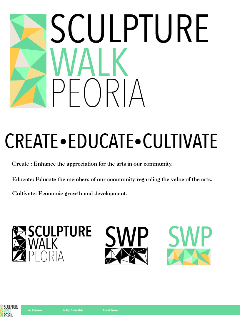
This was yet another project from my branding course, but it is unique in that this one was a group project. My team of three was tasked with coming up with a brand identity and promotional materials for the then brand new Sculpture Walk Peoria. My team actually ended up winning the bid from the SWP board, but they ultimately ended up going through Simantel instead of student work.


What really informed our vision for the brand was the black and white photography of sculpture on their site. My team latched onto that stark contrast and simplicity and carried that through the whole brand image.  The one thing I can't remember is how we came to triangles;I think we all just thought they looked nice. Although, we did end up assigning a buzz word to each side of the triangle in an attempt to justify the motif. In playing with the triangles, our  logo morphed into a stained glass pattern that could be expanded and layered over almost anything. I think what really sold the client on our design was the way the logo could be carried across all of the brand touch points and still look fantastic. The colors were meant to reflect that idea of being outside on a sunny day in downtown Peoria. While the typefaces were chosen to reflect this idea of simplicity and generate a kind of quiet elegance. We then extended these brand guidelines into several possible promotional materials including an app, brochure and direct mail piece. The direct mail piece was my personal favorite aspect because it came folded as a neat triangle to reflect our logo. I sincerely regret not photographing the mocked up version when I had the chance. Overall, I was incredibly happy with the way this project turned out. It felt good to come out on top of the class, even if we did not end up getting the client in the long run.


Wednesday, September 30, 2015

Single Serve Meal Design


I thought I would take a look at another project from my branding course last semester. This time the brief  was to create an expensive/gourmet single serve meal(including package design) for Wal-Mart. Ideally, the meal and it's package would be as recyclable as possible.The contents of the meal and the target audience was left up to the students. Once again, I started this project off with a lot of ideas. I decided immediately that I wanted to get weird with it. I initially pitched several ideas including: A hobo meal that came wrapped in a handkerchief at the end of a stick, an astronaut meal where everything came in tubes, a frat star meal that contained a beer bong etc. Ultimately I decided to take the low route by attacking the stereotypical Wal-Mart customer, the redneck. Admittedly I may have taken the humor so far as to negate any practicality.

I felt as if a redneck meal was the perfect fit for Wal-Mart.  However, my original lighthearted tone regarding the subject matter was slowly replaced by a mean streak. I elected to base my box design around a buckle, because it was the most visually interesting diagram I found online. From that point the image of a beer belly barely contained by a wife beater and jeans came naturally to mind. This certainly was not the high-class meal option that the brief was looking for. This issue was compounded when I decided that a confederate flag was the right buckle to anchor my design around. I took the red, blue, and white and plastered it on everything.  While it made sense with my concept and tone, I am not confident that it was in line with the assignments goals. I did manage to inject some lighthearted humor with my employment of the box itself as an animal trap. But, perhaps I took it too far when I included bigotry on the list of ingredients. That being said, I would rather take something too far then not far enough. This assignment was unique for the semester because it was not for a real client. It was a rare opportunity to go in a strange direction.
I tried to brainstorm the strangest food items I could put into the box. To be honest, I spent the majority of this project working on the look of the food items and I think that’s pretty evident in the final product. The food display was the first page I worked on and I was so proud of that page that I was forced to commit to that art style for the rest of the project. It was a lot more difficult to adapt that style to the rest of the assignment and the whole package suffered for it. I chose the moonshine over beer or RC cola because the jar could be reused after the rest of the box was disposed of. I initially wanted the meal to be based around some kind of squirrel jerky or stew, but ultimately felt that mystery jerky was a funnier option. Furthermore, I chose to package the jerky in a cup in an attempt at dual functionality. A redneck that dips is always in need of a spitter. When the consumer goes to the chewing tobacco for dessert they can reuse the thick paper cup as a spitter. The corn, moonpie and tobacco are just redneck staples and I needed smaller food items to round out the meal.
I came up with the inside packaging last. I was still trying to keep that idea of recyclability in mind so anymore cardboard or paper was out of the equation for me. I figured if I was taking the joke this far anyway, I should use hay as the packing material to cushion the food items. The type of person this meal is catering to likely would not care if their meal had a bit of hay on it. Following this logic I left the corn and moonpie unpackaged to further reduce waste. The added benefit of using hay was its dual use as bait for the rabbit trap.
Overall, I like how the project turned out. When I rework everything for my portfolio come spring, I will definitely consider changing the art style. I also think that the box needed to be mocked up in order to function as a portfolio piece. The execution can always go higher when not limited by time constraints.