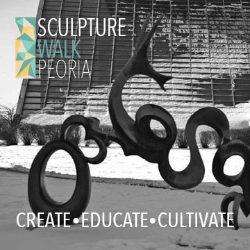
What really informed our vision for the brand was the black and white photography of sculpture on their site. My team latched onto that stark contrast and simplicity and carried that through the whole brand image. The one thing I can't remember is how we came to triangles;I think we all just thought they looked nice. Although, we did end up assigning a buzz word to each side of the triangle in an attempt to justify the motif. In playing with the triangles, our logo morphed into a stained glass pattern that could be expanded and layered over almost anything. I think what really sold the client on our design was the way the logo could be carried across all of the brand touch points and still look fantastic. The colors were meant to reflect that idea of being outside on a sunny day in downtown Peoria. While the typefaces were chosen to reflect this idea of simplicity and generate a kind of quiet elegance. We then extended these brand guidelines into several possible promotional materials including an app, brochure and direct mail piece. The direct mail piece was my personal favorite aspect because it came folded as a neat triangle to reflect our logo. I sincerely regret not photographing the mocked up version when I had the chance. Overall, I was incredibly happy with the way this project turned out. It felt good to come out on top of the class, even if we did not end up getting the client in the long run.
Wednesday, October 7, 2015
Sculpture Walk Peoria
This was yet another project from my branding course, but it is unique in that this one was a group project. My team of three was tasked with coming up with a brand identity and promotional materials for the then brand new Sculpture Walk Peoria. My team actually ended up winning the bid from the SWP board, but they ultimately ended up going through Simantel instead of student work.
What really informed our vision for the brand was the black and white photography of sculpture on their site. My team latched onto that stark contrast and simplicity and carried that through the whole brand image. The one thing I can't remember is how we came to triangles;I think we all just thought they looked nice. Although, we did end up assigning a buzz word to each side of the triangle in an attempt to justify the motif. In playing with the triangles, our logo morphed into a stained glass pattern that could be expanded and layered over almost anything. I think what really sold the client on our design was the way the logo could be carried across all of the brand touch points and still look fantastic. The colors were meant to reflect that idea of being outside on a sunny day in downtown Peoria. While the typefaces were chosen to reflect this idea of simplicity and generate a kind of quiet elegance. We then extended these brand guidelines into several possible promotional materials including an app, brochure and direct mail piece. The direct mail piece was my personal favorite aspect because it came folded as a neat triangle to reflect our logo. I sincerely regret not photographing the mocked up version when I had the chance. Overall, I was incredibly happy with the way this project turned out. It felt good to come out on top of the class, even if we did not end up getting the client in the long run.
What really informed our vision for the brand was the black and white photography of sculpture on their site. My team latched onto that stark contrast and simplicity and carried that through the whole brand image. The one thing I can't remember is how we came to triangles;I think we all just thought they looked nice. Although, we did end up assigning a buzz word to each side of the triangle in an attempt to justify the motif. In playing with the triangles, our logo morphed into a stained glass pattern that could be expanded and layered over almost anything. I think what really sold the client on our design was the way the logo could be carried across all of the brand touch points and still look fantastic. The colors were meant to reflect that idea of being outside on a sunny day in downtown Peoria. While the typefaces were chosen to reflect this idea of simplicity and generate a kind of quiet elegance. We then extended these brand guidelines into several possible promotional materials including an app, brochure and direct mail piece. The direct mail piece was my personal favorite aspect because it came folded as a neat triangle to reflect our logo. I sincerely regret not photographing the mocked up version when I had the chance. Overall, I was incredibly happy with the way this project turned out. It felt good to come out on top of the class, even if we did not end up getting the client in the long run.
Subscribe to:
Post Comments (Atom)


Nice work. I wish this walk was more publicized. I feel like it's yet another Peoria event that will fly under the radar.
ReplyDelete