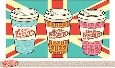
I thought it would be interesting to share and take a critical look at one of my projects from branding class last semester. I'm going to attempt to examine both what I loved about the project and what I wish I had focused more attention on. We were given the task of developing a new identity for Rickee Rockets (My only gripe was that the client insisted we keep the name) a swinging sixties themed coffee shop that was going to be opening in Carbondale. I've always had an affinity for the style and I was fresh off a J-term study abroad in London, so I was eager to get to work. I began this project with a mood
board and that document spiraled organically into the actual work. I was looking at
album covers, wallpaper patterns and pop art from the time period and
everything sort of filtered down into one look. I’ve always liked the font from
the A Hard Days Night poster. When I
finally tracked it down I might have gotten a bit too excited because I threw it on everything. Quickly the first
real work started with the logo. I was so enamored with the Beatles font that I
felt I had to use it. Looking back I think that I approached the logo too
literally. I just threw up a 60s font and a rocket ship and called it a day. I
later tried to use the brown to give the suggestion of a coffee cup rim and
halfheartedly connected the jet stream to the two e’s on the end of Rickee’s. Maybe
the logos nice to look at, but more thought certainly could have gone into it. I
kept repeating the same mistake over again; I merely slapped wallpaper designs
onto standard coffee cups. In retrospect maybe more than simple pattern
is necessary if a shop hopes to stand out against competition.
 |
| A poorly photoshopped mock up of the shops exterior |
When it came time to design the actual shop, I was too strapped for time to produce anything worthwhile. Ideally, I envisioned the shops exterior covered in psychedelic murals akin to the Beatle’s Apple Boutique (I nicked a bit much from the Beatles this project). I felt that Rickee Rocket’s needed to be strange and loud if it wanted to stand out in the crowded marketplace of coffee shops and the mural would help it accomplish just that. Moreover, the interior needed to be experiential and functional at the same time. The patron should feel as if they are being transported back in time. On a basic level the shop would include plenty of retro organic modern furniture and light fixtures. On top of that though, the music playing would always be reflective of the time period.
In terms of brand touch points, I pitched this coffee shop to put out a
newsletter concerning the arts in the area. The whole goal of the shop was to foster creativity and collaboration within the area, so sponsoring a zine would fit into the brand identity nicely. The zine could draw
heavily from past publications, most notably London’s version of OZ, which fit
in with the swinging 60’s aesthetic. Adding to the community feel, perhaps
Rickee Rocket’s could utilize an employee recommendation section similar to
Barnes & Noble. In terms of the actual clothing for the employees, I was
not sure whether to dress them in simple color coordinated uniforms or the
clothes of the time. I finally decided on dressing them in period appropriate
outfits. I am still uncertain if this was the right decision. The work could be
messy and maybe the employees could have been dressed in quasi tuxedo shirts
that were suggestive of the actual outfits, yet still allowed functionality. At
the very least I wish I had the time to draw the people out myself. In my head
I envisioned my concepts as vintage fashion illustrations. However, this search
for clothing did leave me thinking about mods. The moped is so closely aligned
with mod culture that I couldn’t help but include one. The most unique part of my pitch was the concept of the moped delivery man. I do not know about cost
effectiveness, but seeing a deliveryman in uniform on the moped would certainly
stick in anyone’s mind. The moped touch point has the potential to raise brand
awareness through simple word of mouth. Another possible feature for the shop
to include was a small vintage antique store. Rocket’s could lure people in
with antiques and get them to stay with the coffee.
Revisiting this after a year away. Has left me reconsidering a number of my choices. However, I still believe in the general direction I took things. The execution could certainly be improved, but I think my thinking behind the graphics was solid. It definitely pops out at you, which is something I felt was extremely important to an independent coffee shop trying to fight back against the corporate chains. There is always room for improvement and with a little work I'm sure this could be a nice portfolio piece.


I never had the chance to see your project last semester! But I absolutely love your take on it! It's very 60's! I feel like mostly everyone in our class focused on the whole "steampunk" theme more than anything. But your take on it is very refreshing!
ReplyDeleteWhat an interesting concept for a coffee shop, and I love your take on it! Good stuff.
ReplyDelete