Wednesday, September 30, 2015

Single Serve Meal Design


I thought I would take a look at another project from my branding course last semester. This time the brief  was to create an expensive/gourmet single serve meal(including package design) for Wal-Mart. Ideally, the meal and it's package would be as recyclable as possible.The contents of the meal and the target audience was left up to the students. Once again, I started this project off with a lot of ideas. I decided immediately that I wanted to get weird with it. I initially pitched several ideas including: A hobo meal that came wrapped in a handkerchief at the end of a stick, an astronaut meal where everything came in tubes, a frat star meal that contained a beer bong etc. Ultimately I decided to take the low route by attacking the stereotypical Wal-Mart customer, the redneck. Admittedly I may have taken the humor so far as to negate any practicality.

I felt as if a redneck meal was the perfect fit for Wal-Mart.  However, my original lighthearted tone regarding the subject matter was slowly replaced by a mean streak. I elected to base my box design around a buckle, because it was the most visually interesting diagram I found online. From that point the image of a beer belly barely contained by a wife beater and jeans came naturally to mind. This certainly was not the high-class meal option that the brief was looking for. This issue was compounded when I decided that a confederate flag was the right buckle to anchor my design around. I took the red, blue, and white and plastered it on everything.  While it made sense with my concept and tone, I am not confident that it was in line with the assignments goals. I did manage to inject some lighthearted humor with my employment of the box itself as an animal trap. But, perhaps I took it too far when I included bigotry on the list of ingredients. That being said, I would rather take something too far then not far enough. This assignment was unique for the semester because it was not for a real client. It was a rare opportunity to go in a strange direction.
I tried to brainstorm the strangest food items I could put into the box. To be honest, I spent the majority of this project working on the look of the food items and I think that’s pretty evident in the final product. The food display was the first page I worked on and I was so proud of that page that I was forced to commit to that art style for the rest of the project. It was a lot more difficult to adapt that style to the rest of the assignment and the whole package suffered for it. I chose the moonshine over beer or RC cola because the jar could be reused after the rest of the box was disposed of. I initially wanted the meal to be based around some kind of squirrel jerky or stew, but ultimately felt that mystery jerky was a funnier option. Furthermore, I chose to package the jerky in a cup in an attempt at dual functionality. A redneck that dips is always in need of a spitter. When the consumer goes to the chewing tobacco for dessert they can reuse the thick paper cup as a spitter. The corn, moonpie and tobacco are just redneck staples and I needed smaller food items to round out the meal.
I came up with the inside packaging last. I was still trying to keep that idea of recyclability in mind so anymore cardboard or paper was out of the equation for me. I figured if I was taking the joke this far anyway, I should use hay as the packing material to cushion the food items. The type of person this meal is catering to likely would not care if their meal had a bit of hay on it. Following this logic I left the corn and moonpie unpackaged to further reduce waste. The added benefit of using hay was its dual use as bait for the rabbit trap.
Overall, I like how the project turned out. When I rework everything for my portfolio come spring, I will definitely consider changing the art style. I also think that the box needed to be mocked up in order to function as a portfolio piece. The execution can always go higher when not limited by time constraints. 


Monday, September 21, 2015

Rickee Rockets


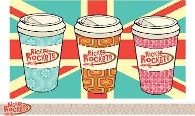
I thought it would be interesting to share and take a critical look at one of my projects from branding class last semester. I'm going to attempt to examine both what I loved about the project and what I wish I had focused more attention on. We were given the task of developing a new identity for Rickee Rockets (My only gripe was that the client insisted we keep the name) a swinging sixties themed coffee shop that was going to be opening in Carbondale. I've always had an affinity for the style and I was fresh off a J-term study abroad in London, so I was eager to get to work. I began this project with a mood board and that document  spiraled organically  into the actual work. I was looking at album covers, wallpaper patterns and pop art from the time period and everything sort of filtered down into one look. I’ve always liked the font from the A Hard Days Night poster. When I finally tracked it down I might have gotten a bit too excited because I  threw it on everything. Quickly the first real work started with the logo. I was so enamored with the Beatles font that I felt I had to use it. Looking back I think that I approached the logo too literally. I just threw up a 60s font and a rocket ship and called it a day. I later tried to use the brown to give the suggestion of a coffee cup rim and halfheartedly connected the jet stream to the two e’s on the end of Rickee’s. Maybe the logos nice to look at, but more thought certainly could have gone into it. I kept repeating the same mistake over again; I merely slapped wallpaper designs onto standard coffee cups. In retrospect maybe more  than simple pattern is necessary if a shop hopes to stand out against competition. 


A poorly photoshopped mock up of the shops exterior
When it came time to design the actual shop, I was too strapped for time to produce anything worthwhile. Ideally, I envisioned the shops exterior covered in psychedelic murals akin to the Beatle’s Apple Boutique (I nicked a bit much from the Beatles this project). I felt that Rickee Rocket’s needed to be strange and loud if it wanted to stand out in the crowded marketplace of coffee shops and the mural would help it accomplish just that. Moreover, the interior needed to be experiential and functional at the same time. The patron should  feel as if they are being transported back in time.  On a basic level the shop would include plenty of retro organic modern furniture and light fixtures. On top of that though, the music playing would always be reflective of the time period.


In terms of brand touch points, I pitched this coffee shop to put out a newsletter concerning the arts in the area. The whole goal of the shop was to foster creativity and collaboration within the area, so sponsoring a zine would fit into the brand identity nicely. The zine could draw heavily from past publications, most notably London’s version of OZ, which fit in with the swinging 60’s aesthetic. Adding to the community feel,  perhaps Rickee Rocket’s could utilize an employee recommendation section similar to Barnes & Noble. In terms of the actual clothing for the employees, I was not sure whether to dress them in simple color coordinated uniforms or the clothes of the time. I finally decided on dressing them in period appropriate outfits. I am still uncertain if this was the right decision. The work could be messy and maybe the employees could have been dressed in quasi tuxedo shirts that were suggestive of the actual outfits, yet still allowed functionality. At the very least I wish I had the time to draw the people out myself. In my head I envisioned my concepts as vintage fashion illustrations. However, this search for clothing did leave me thinking about mods. The moped is so closely aligned with mod culture that I couldn’t help but include one. The most unique part of my pitch was the concept of the moped delivery man. I do not know about cost effectiveness, but seeing a deliveryman in uniform on the moped would certainly stick in anyone’s mind. The moped touch point has the potential to raise brand awareness through simple word of mouth. Another possible feature for the shop to include was a small vintage antique store. Rocket’s could lure people in with antiques and get them to stay with the coffee.  
Revisiting this after a year away. Has left me reconsidering a number of my choices. However, I still believe in the general direction I took things. The execution could certainly be improved, but I think my thinking behind the graphics was solid. It definitely pops out at you, which is something I felt was extremely important to an independent coffee shop trying to fight back against the corporate chains. There is always room for improvement and with a little work I'm sure this could be a nice portfolio piece. 


Thursday, September 17, 2015

On Wayfinding and Subway Diagrams


Imagine a world without maps, subway diagrams, or highway signs.  How would people orient themselves or navigate from place to place? People often take these guides for granted, but someone had to construct these information systems and that person was more than likely a designer. Environmental graphic design is a discipline that focuses on wayfinding or the process of using spatial and environmental information to navigate to a destination. Another term for wayfinding is experiential or environmental graphic design. The Society For Experiential Graphic Design (SEGD) describes wayfinding as, “the orchestration of typography, color, imagery, form, technology and, especially, content to create environments that communicate” .  These are the forms of design that are often overlooked as works of art, but have been through a huge shift in the last hundred years.


The first significant contribution to wayfinding in the early 20th century was Harry Beck’s 1933 map of the London Underground. Beck was an engineering draftsman for the London Underground Signals Office who created the map in his free time. Prior to Beck’s reimagining, "every station was spaced to geographic scale, resulting in a cluster of dots around central London, with just a sprinkling near the city’s outskirts. Interchanges weren't clearly rendered, and every tube line was represented with a curve showing its true path” (Toor). Beck took it upon himself to simplify the design by replacing the curved lines with straight lines, verticals, horizontals, and forty-five degree angles. He also altered the scale by placing stations equidistantly and removed the superimposed above ground street grid. The result was a, “sparse, circuit board-like design that eschewed geographic accuracy for legibility” (Toor). The 1933 map was revolutionary; it inspired many imitations around the world and is still largely retained to this day.


Massimo Vignelli was one designer that drew inspiration from Harry Beck’s reimagining of London’s Underground. Vignelli was an Italian designer who had immigrated to the United States in 1965 to set up a New York design studio, Vignelli Associates, with his wife, Leila. In 1972 Vignelli was commissioned to design a map of the New York subway system for the M.T.A.  He was a modernist who, like Beck, “sacrificed geographical accuracy for clarity by reinterpreting New York’s tangled labyrinth of subway lines as a neat diagram.” (Rawsthorn). Vignelli also employed a system of dots linked by color-coded routes at 45 or 90-degree angles. However, there were differences in Vignelli’s approach as he did indicate some geographic locations, such as Central Park. Yet, “Beck’s design was [still] gentler in style, particularly in its choice of typography, [because] Mr. Vignelli used the searingly modern font Helvetica” (Rawsthorn). Designers loved the Italian’s interpretation, but New Yorker’s did not feel the same way. Many people found Vignelli’s map confusing; many stations appeared to sit out of place and the water surrounding the city was colored beige instead of blue. Part of the issue was that the M.T.A. had only implemented one of four maps that the designer had proposed. Vignelli had intended that there be geographic maps in the stations to pair with his diagram, and this lack of synchronization was likely the reason that the M.T.A. issued a new map in 1979 (Rawsthorn).  
These two very modernist approaches to map making revolutionized subway diagrams. Though their work is often overlooked by the general public, the impact it's had cannot be. 

Rawsthorn, Alice. "The Subway Map That Rattled New Yorkers." The New York Times. The New York Times, 05 Aug. 2012. Web. 19 Apr. 2015. <http://www.nytimes.com/2012/08/06/arts/design/the-subway-map-that-rattled-new-yorkers.html?_r=0>.
Toor, Amar. "Meet Harry Beck, the Genius behind London's Iconic Subway Map." The Verge. The Verge, 29 Mar. 2013. Web. 19 Apr. 2015. <http://www.theverge.com/2013/3/29/4160028/harry-beck-designer-of-iconic-london-underground-map>.